21 Dollar Store Decor Ideas That Don’t Look Cheap
21 Dollar Store Decor Ideas That Don’t Look Cheap
There’s an art to shopping the dollar store without your home looking like a dollar store. The secret isn’t spending more — it’s knowing which dollar store decor ideas have that expensive look baked in, and which ones to leave on the shelf. These 21 are the keepers: the finds that fool interior designers, not just your mother-in-law.
1. The Matching Rule
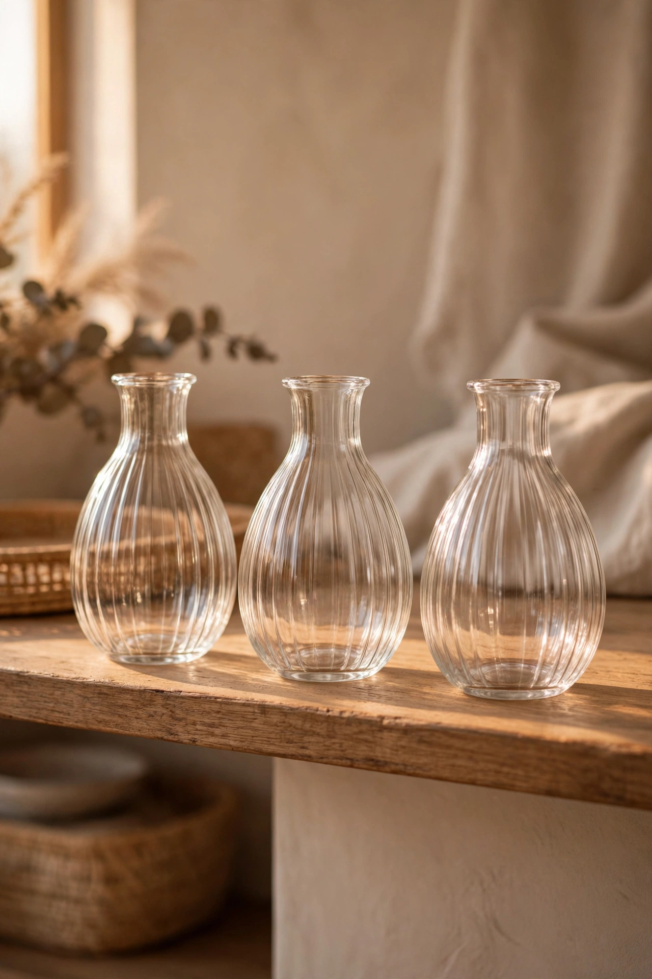
Buy everything in matching sets and cheap instantly looks curated. Three identical vases, four matching frames, a set of same-finish baskets — uniformity is the fastest route to expensive-looking. Shop with a list so you don’t come home with five “similar” things. I tried this and the one mistake to avoid is the near-match trap; two slightly different whites side by side look wrong in a way two identical cheap whites never do. Exact matches only. Photograph your sets before a big shop — the photo stops you buying near-matches you will regret at home.
Cost: ~$6 | Time: 10 minutes
2. Glass Over Plastic
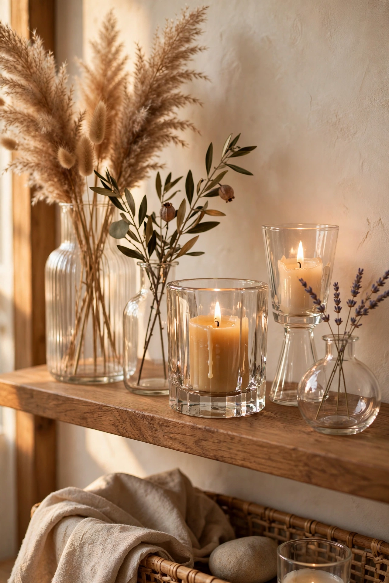
Wherever there’s a choice, pick the glass version. Glass vases, glass jars, glass candle holders — glass has a weight and clarity that plastic can’t fake, and at dollar store prices the difference is pennies. I tried this and the one mistake to avoid is frosted plastic masquerading as sea glass; hold it up to the light in the shop. If it looks cloudy and light, it’s plastic. Real glass has heft. Check charity shops for real glass first — second-hand glass vases cost the same as new plastic and look far better.
Cost: ~$5 | Time: 5 minutes
3. The Odd-Number Cluster
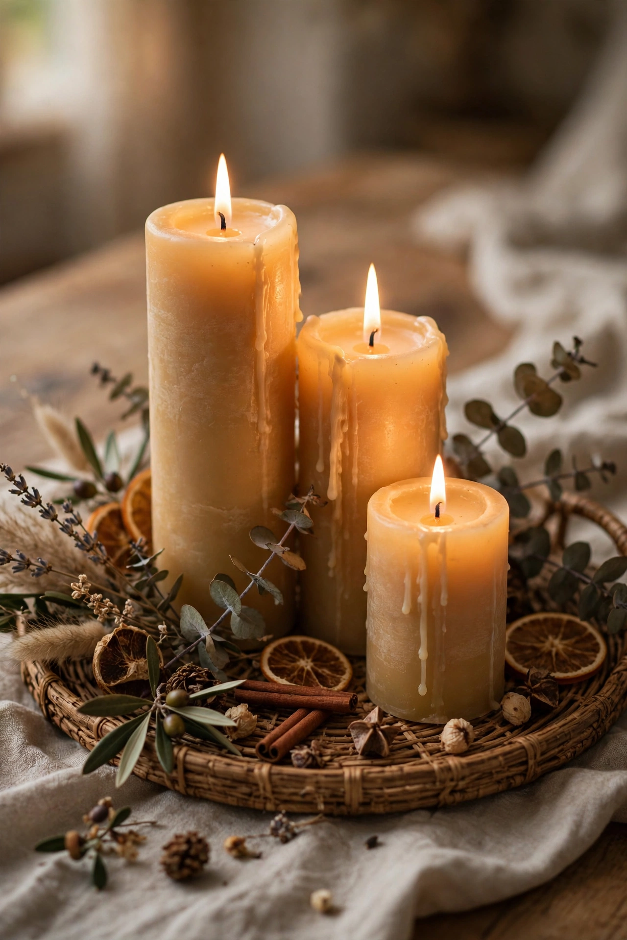
Stylists group objects in threes and fives for a reason — odd numbers look natural, even numbers look staged. Three candles on a tray, five small frames on a wall. Arrange them at varying heights and step back to check. I tried this and the one mistake to avoid is perfect symmetry in the cluster; a rigid triangle of identical objects looks like a shop display. Vary heights and let it breathe. Take a phone photo of each arrangement — the camera reveals imbalances your eyes miss in person.
Cost: ~$4 | Time: 10 minutes
4. Faux Marble Contact Paper
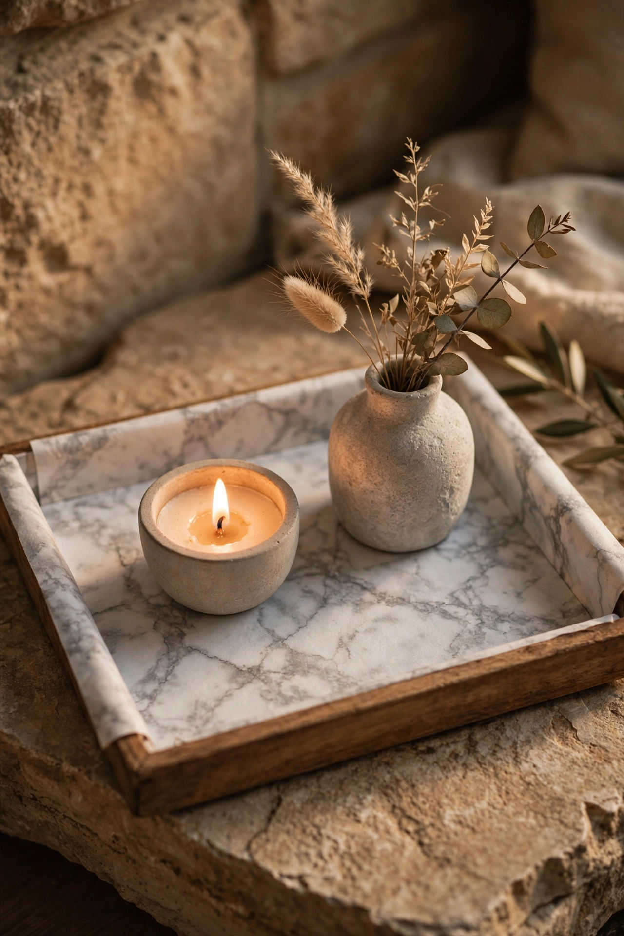
A roll of faux marble contact paper upgrades trays, shelf liners and table tops into stone-look surfaces. Apply slowly with a smoothing card, wrap edges for a finished look, and keep it to one or two surfaces per room. I tried this and the one mistake to avoid is marbling everything in sight; one marble moment per room is chic, five is a quarry. Edit ruthlessly. Save this one for later — you’ll thank yourself when spring rolls around and you fancy a refresh.
Cost: ~$5 | Time: 25 minutes
5. Warm White Lighting Only
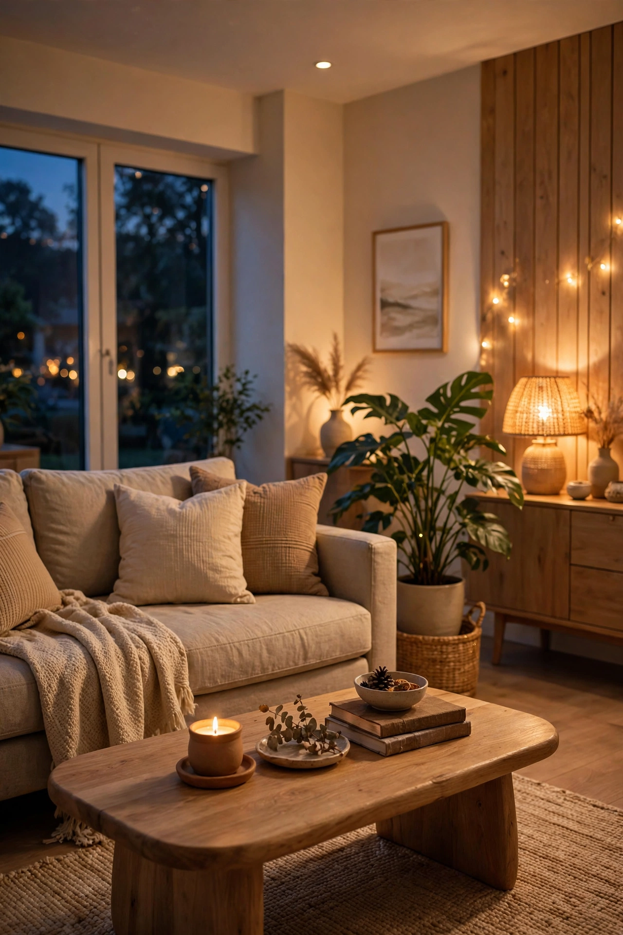
Swap every cool-white bulb for warm white and the whole house instantly feels richer. Cool light exposes every cheap finish; warm light flatters everything it touches. Check the Kelvin rating — 2700K is the sweet spot. I tried this and the one mistake to avoid is mixing colour temperatures in one room; one warm lamp next to one cool overhead looks off even if you can’t say why. All warm, everywhere. Replace the bulbs in table lamps first — they are the lights you actually live under in the evening.
Cost: ~$6 | Time: 20 minutes
6. Decant Everything
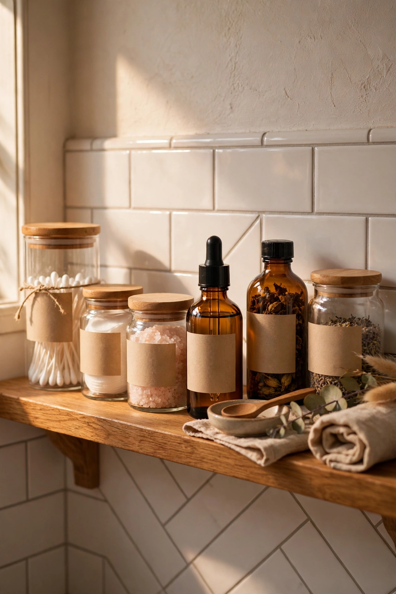
Shampoo, soap, pasta, cotton balls — decanting into matching containers is the single biggest cheap-to-chic move there is. Buy uniform bottles and jars, add simple labels, and banish branded packaging from visible surfaces. I tried this and the one mistake to avoid is decanting into mismatched containers; that’s just rearranging clutter. Uniform vessels or don’t bother. Start with the surfaces guests see — hallway and living room first, the inside of the airing cupboard can wait. A label maker keeps every container looking sharp and uniform.
Cost: ~$8 | Time: 30 minutes
7. The Tray Trick
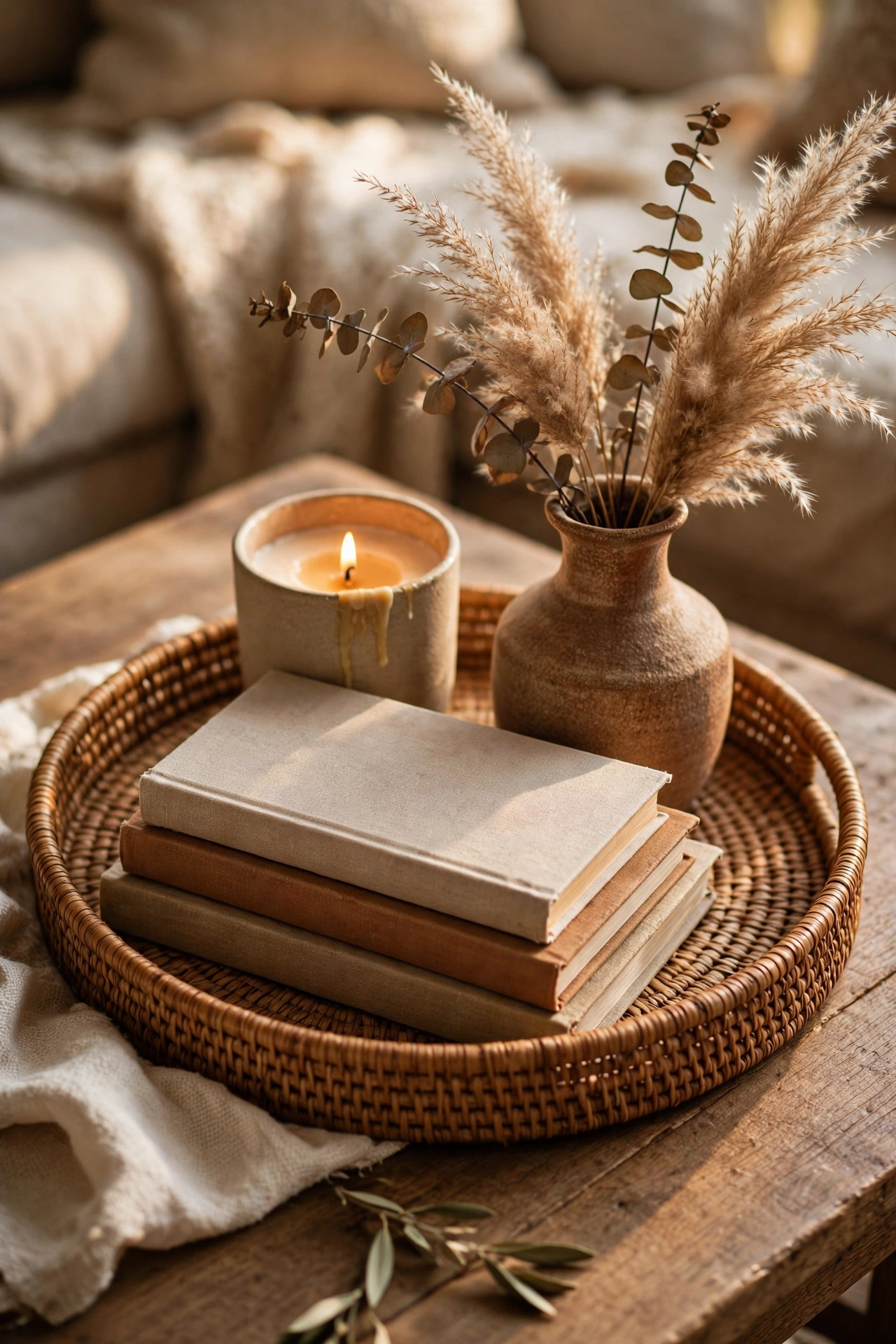
Corral tabletop bits onto a tray and scattered objects become a vignette. The tray’s edge frames the composition, which is why everything inside it looks deliberate. Choose trays with texture — woven, wood, hammered metal. I tried this and the one mistake to avoid is a tray smaller than its contents; items spilling over the edge look accidental. Everything comfortably inside, with margin. A round tray softens a square coffee table — contrasting shapes keep the vignette from looking boxy.
Cost: ~$4 | Time: 5 minutes
8. Spray Paint Unifier
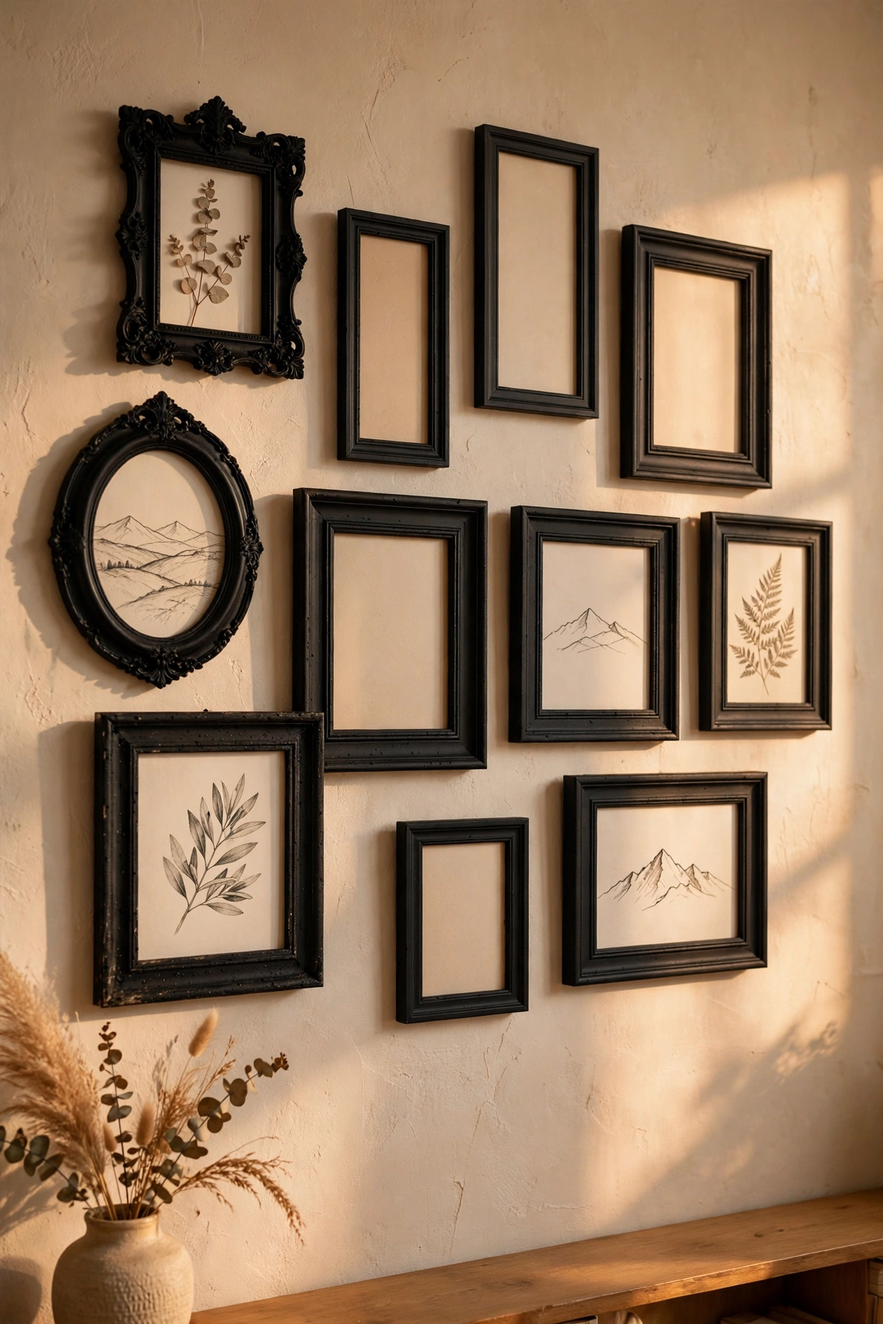
A can of matte black or brushed-gold spray paint unifies mismatched frames, vases and hardware into a coherent collection. Clean pieces first, spray light coats, and let each dry fully. I tried this and the one mistake to avoid is one thick coat — it drips and looks worse than before. Three whisper-light coats beat one heavy one. For more paint tricks see (see also: 19-dollar-store-decor-ideas-worth-every-penny). Mask off any glass panels before spraying — overspray on glass is miserable to scrape off afterwards.
Cost: ~$5 | Time: 45 minutes
9. Faux Greenery, Done Right
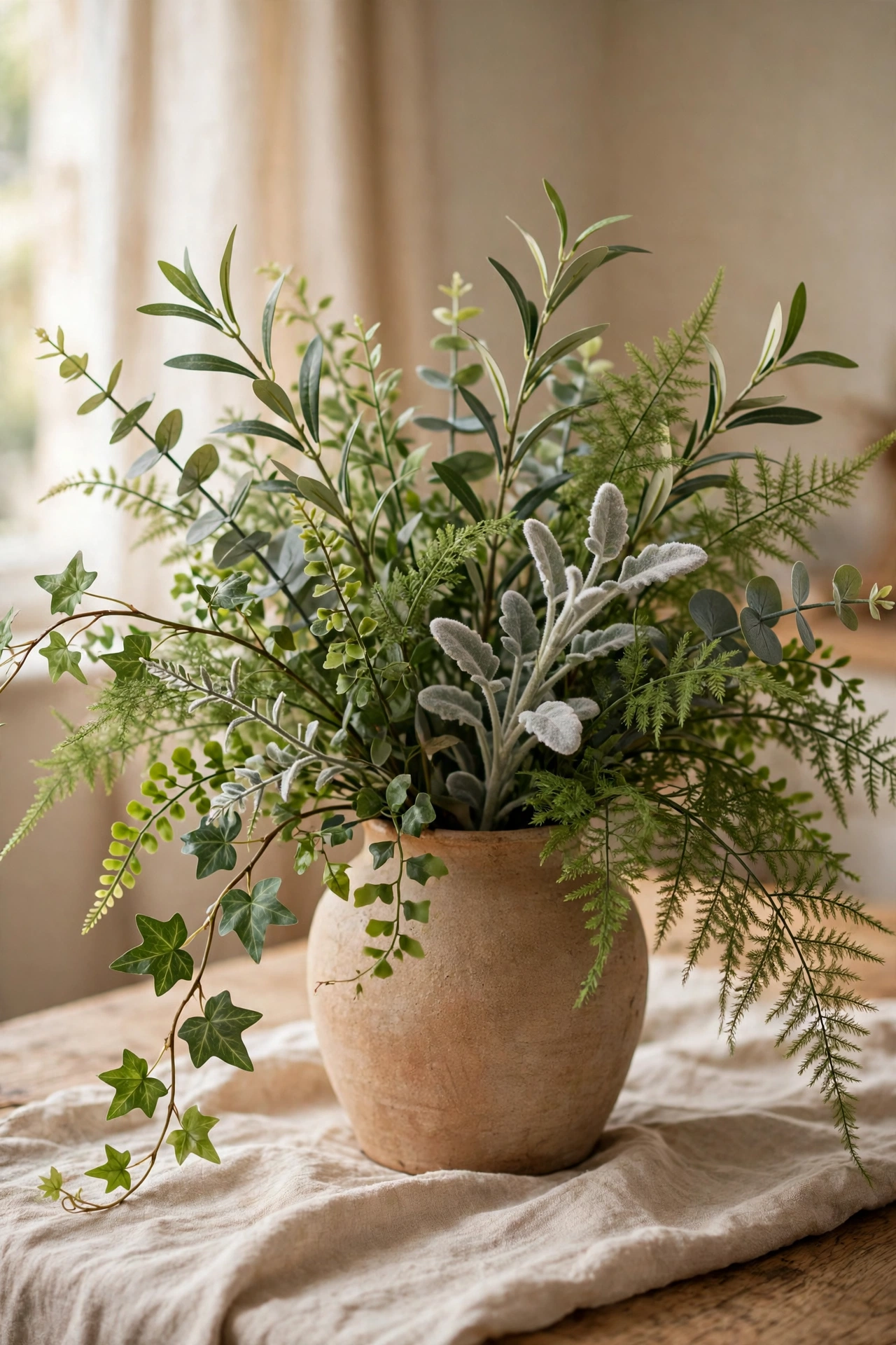
Good faux greenery fools everyone; bad faux greenery fools no one. Choose stems with varied leaf sizes and colours, bend them naturally, and dust monthly. One convincing plant beats five shiny plastic ones. I tried this and the one mistake to avoid is the too-perfect arrangement; nature is asymmetrical. Tousle it like it grew that way. Buy greenery in person, not online — you need to touch the leaves to judge whether they pass the realism test. One statement stem beats a crowd of cheap sprigs every time.
Cost: ~$6 | Time: 15 minutes
10. Linen and Texture
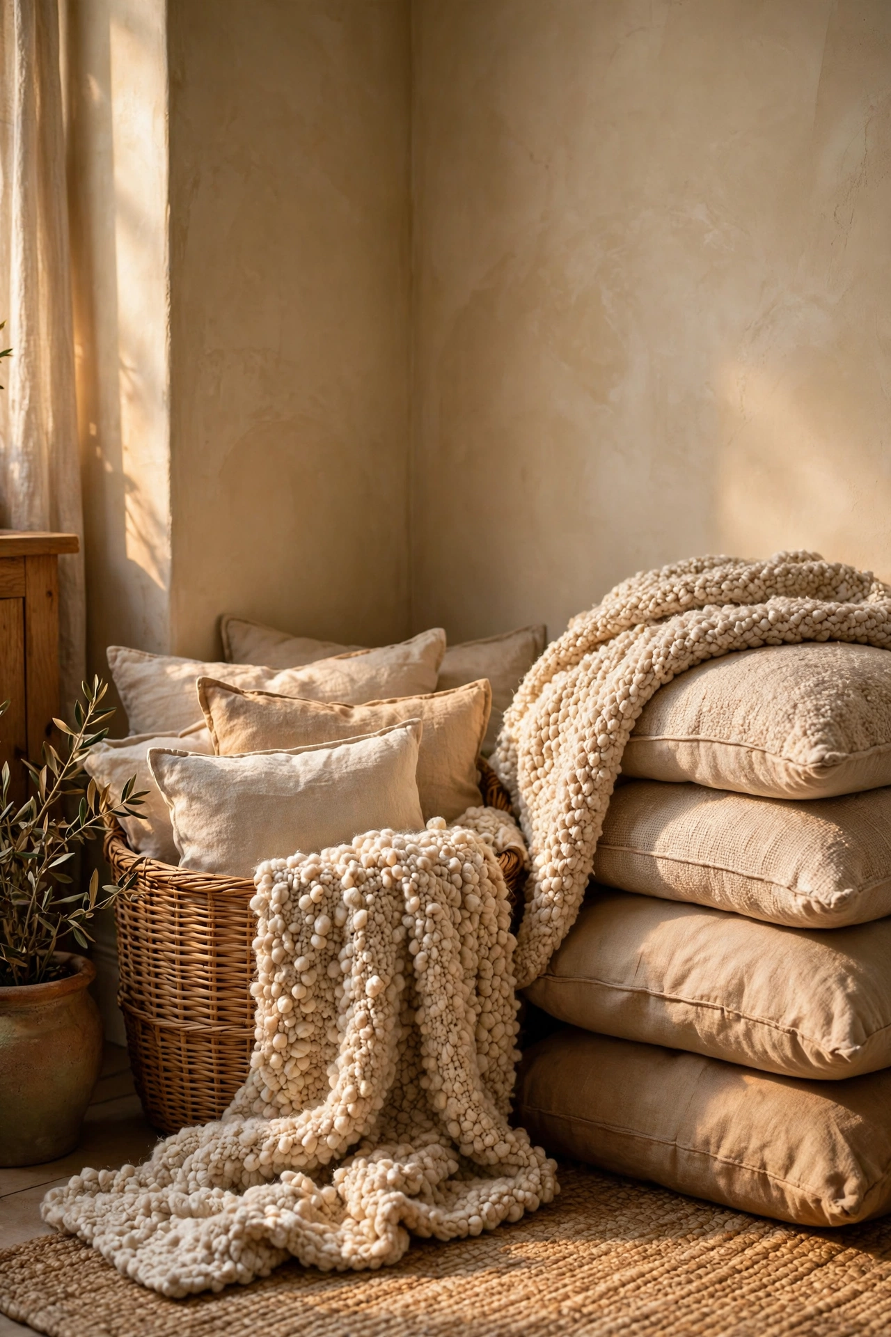
Texture reads as luxury to the human eye. Linen-look cushion covers, woven baskets, nubby throws — layering textures makes cheap fabrics look considered. Mix three textures per zone: smooth, rough, soft. I tried this and the one mistake to avoid is all-shiny-everything; glossy surfaces together look plasticky. Balance shine with matte texture. A nubby throw over one sofa arm is the fastest texture win — it takes ten seconds and changes the whole seat. Touch everything before buying — texture must be felt, not just seen.
Cost: ~$8 | Time: 15 minutes
11. The Gallery Grid
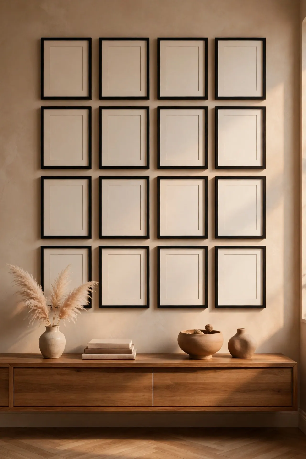
Identical frames in a tight grid look like a designer’s work regardless of what’s inside them. Use a paper template for perfect spacing, keep gaps even, and hang the grid centred on the wall. I tried this and the one mistake to avoid is eyeballing the gaps; uneven spacing is the difference between gallery and dorm room. Measure, mark, then hang. Hang the grid low enough to relate to the furniture below — art floating near the ceiling disconnects from the room.
Cost: ~$8 | Time: 40 minutes
12. Candle Styling
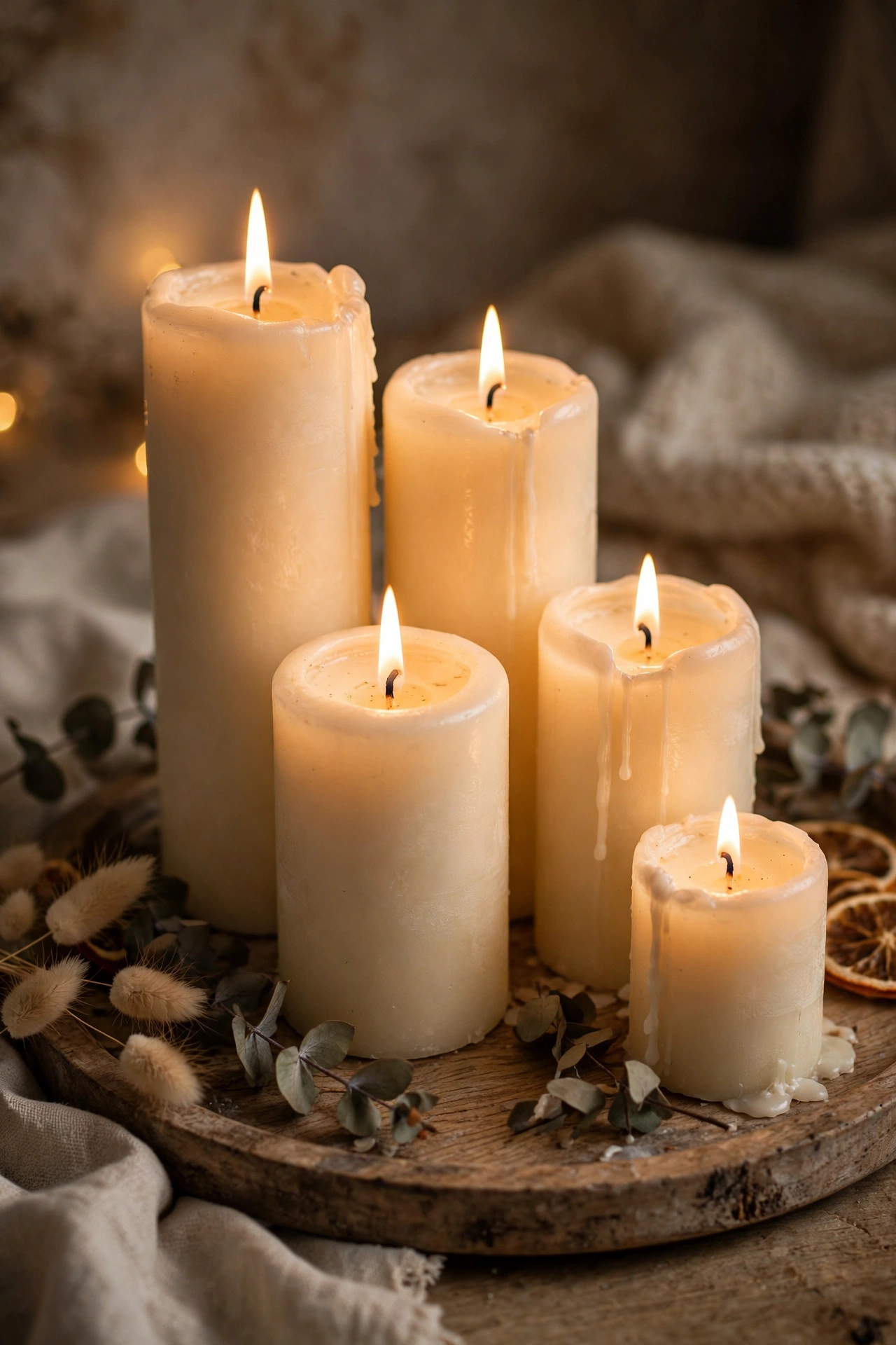
Pillar candles in odd numbers on a tray, wicks trimmed, in one colour family — that’s the whole formula. Lit or unlit, they add warmth and intention. I tried this and the one mistake to avoid is the lone candle; one candle alone looks forgotten, three together look styled. Cluster, always. Trim every wick before the first light — even new candles burn better with a quick 5mm trim. Unscented pillars are the safest choice around food, pets and sensitive noses.
Cost: ~$5 | Time: 10 minutes
13. Book Stack Styling
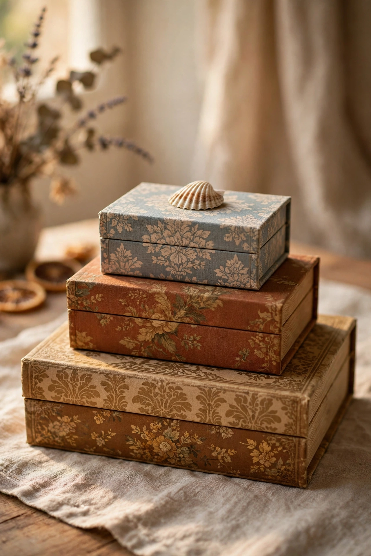
Two or three decorative book boxes stacked largest-to-smallest with a small object on top is a stylist staple. It adds height and hides remotes. I tried this and the one mistake to avoid is stacking real books you never read just for looks; the decorative boxes are designed for this and look better. Form follows function, even in styling. Face the book spines outward if they have pretty covers — real books can look just as good as the faux ones.
Cost: ~$6 | Time: 5 minutes
14. Mirror Placement
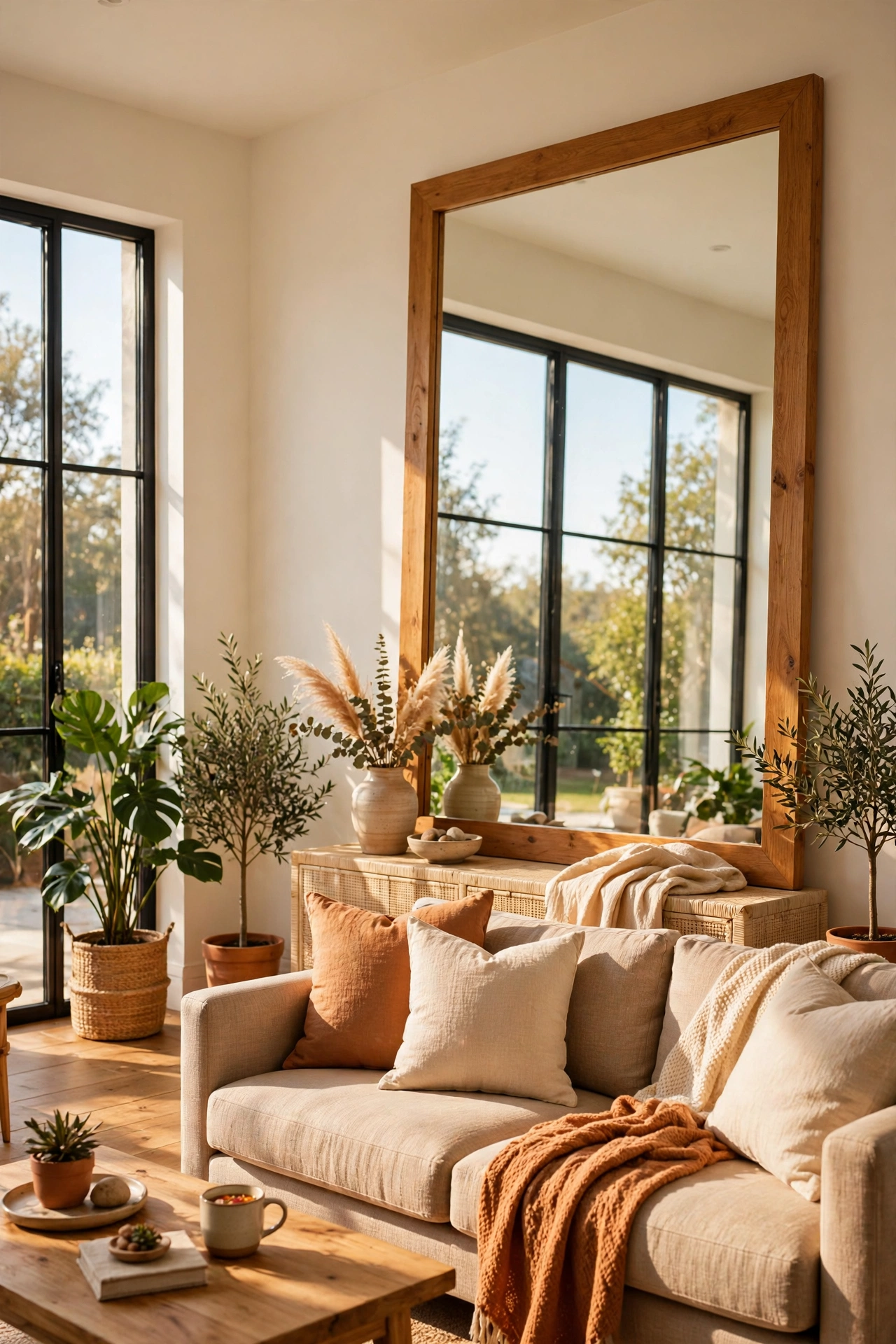
A mirror opposite a window doubles light and makes rooms feel bigger — the oldest designer trick there is. Hang or lean it to catch the view, not the mess. I tried this and the one mistake to avoid is the mirror reflecting clutter; it doubles the mess as efficiently as the light. Aim it at something worth seeing twice. A mirror on the wall perpendicular to the window works too — it bounces light deeper into the room. Clean it well — a streaky mirror ruins the whole illusion.
Cost: ~$8 | Time: 15 minutes
15. The Edit
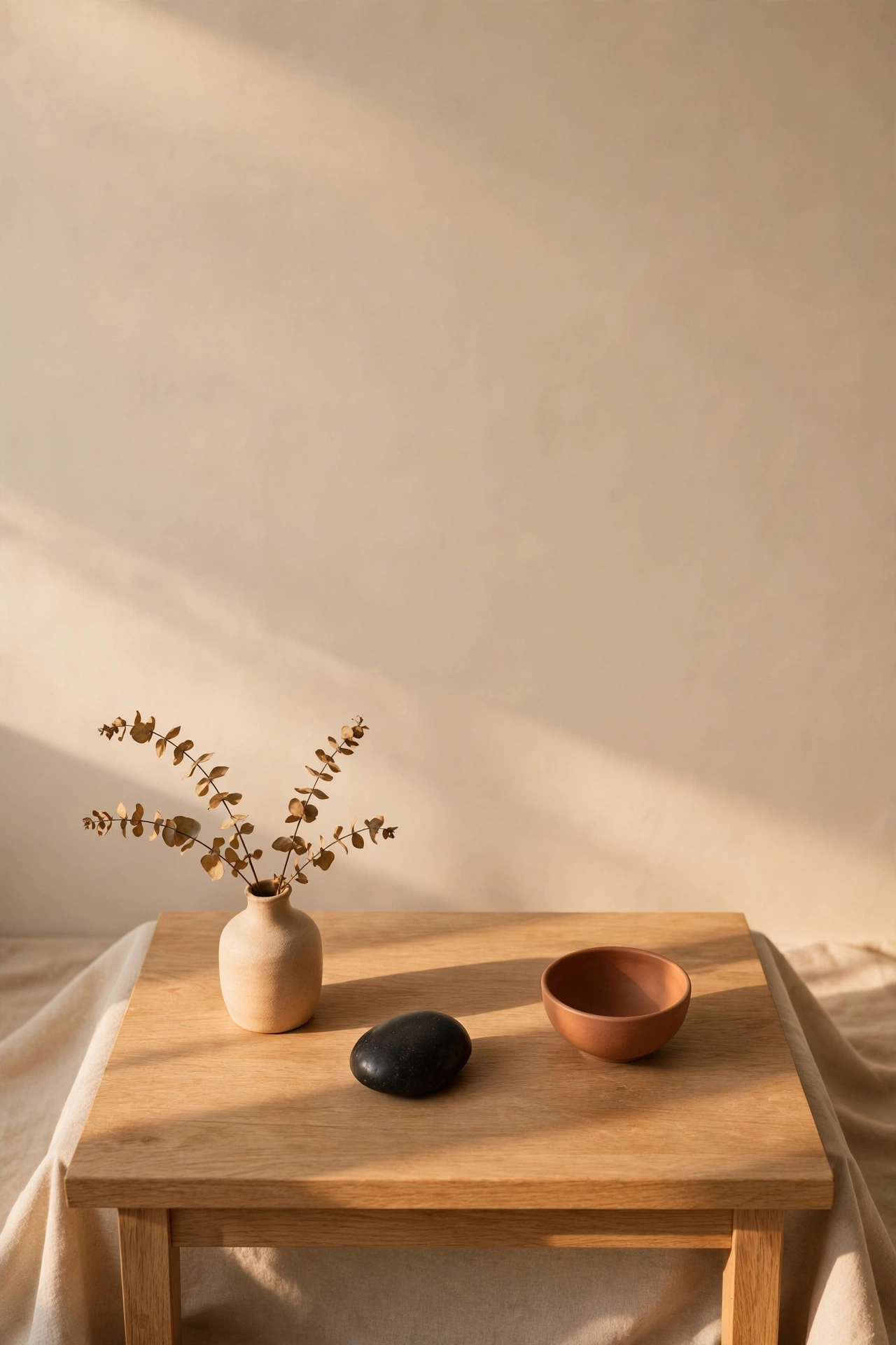
The cheapest luxury of all: remove things. Take everything off a surface, put back only the best third, and box the rest. Negative space reads as confidence and wealth. I tried this and the one mistake to avoid is editing once and never again; clutter creeps back. A monthly five-minute edit keeps surfaces serene. Box the removed items for a month before donating — if you do not miss them, out they go for good. Less really is more when every single piece earns its place.
Cost: ~$0 | Time: 15 minutes
16. Matching Hangers and Bins
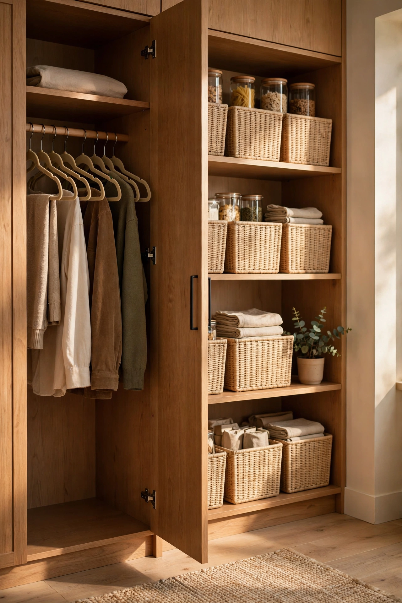
Open the wardrobe or pantry and matching hangers and bins signal order — and order reads as expensive. Swap gradually, one zone at a time, sticking to one type. I tried this and the one mistake to avoid is half-swapped zones; a closet of mixed hangers looks worse than all-wire. Finish one zone completely before starting the next. More organisation wins in (see also: 21-genius-dollar-store-storage-hacks-youll-wish-you-knew-sooner). Start with the most visible storage — the open pantry shelves guests see beat the under-stairs cupboard.
Cost: ~$8 | Time: 30 minutes
17. Hardware Swap
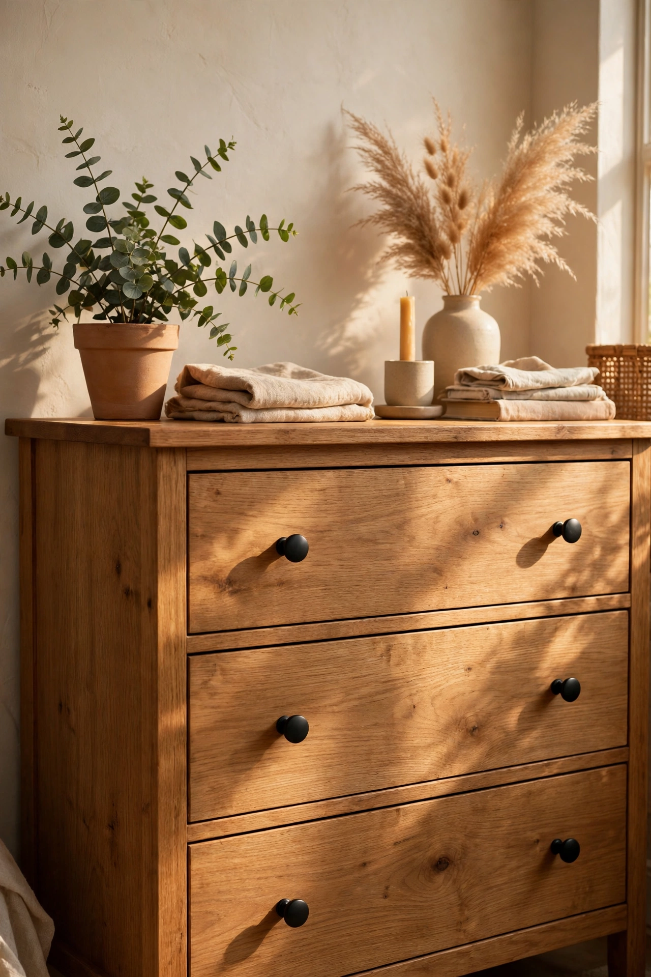
New cabinet knobs or spray-painted pulls update a kitchen or dresser for pennies. Remove old hardware, clean the surface, fit the new — the whole room lifts. I tried this and the one mistake to avoid is mixing old and new hardware on the same piece; it looks like a repair, not an upgrade. All or nothing per piece of furniture. Keep the old hardware in a labelled bag — future buyers or landlords may want the originals back. Bring an old knob to the shop to match the screw size.
Cost: ~$6 | Time: 30 minutes
18. Fresh Flowers, Cheap Stems
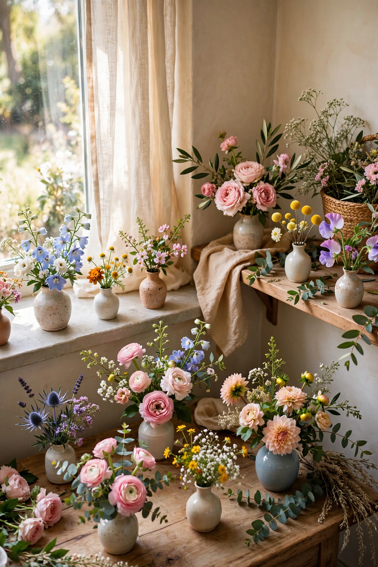
One bunch of supermarket or market flowers split across small bud vases looks more expensive than one big bouquet. Divide stems into threes, place vases around the house, and change water every two days. I tried this and the one mistake to avoid is letting them go brown; dying flowers drag the whole room down. Compost them the moment they fade — no guilt. Strip the lower leaves before arranging — bare lower stems look professional, leafy soup looks amateur.
Cost: ~$5 | Time: 10 minutes
19. Rug Rules
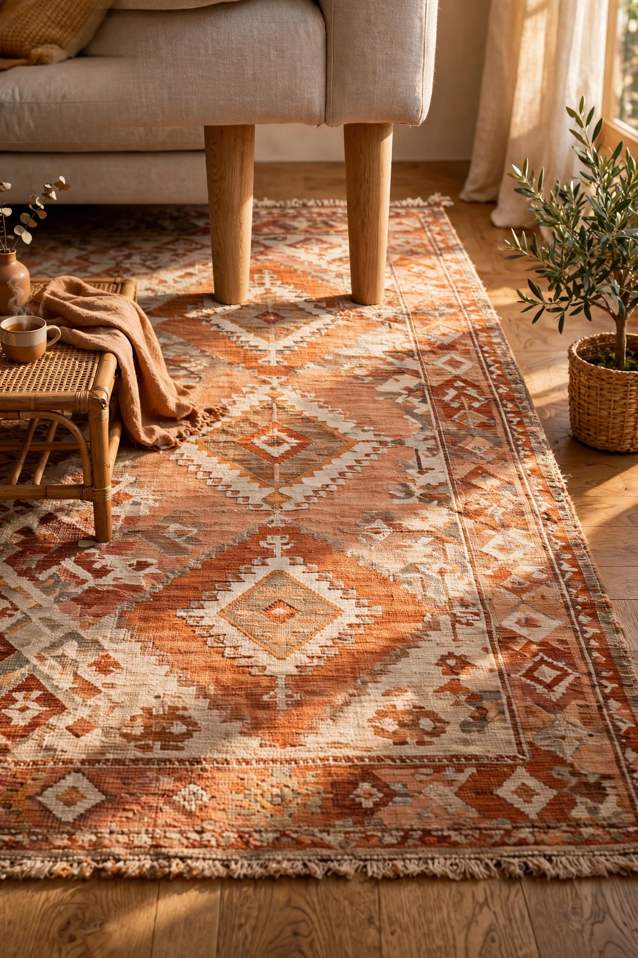
A rug that’s big enough — front legs of furniture on it — makes a room feel designed; a too-small rug makes it feel apologetic. When buying cheap, size matters more than pattern. I tried this and the one mistake to avoid is the postage-stamp rug floating in the middle of the floor; it shrinks the room visually. Go bigger than feels safe. Tape out the rug size on the floor first — the painter’s tape outline shows you the scale before you spend.
Cost: ~$12 | Time: 10 minutes
20. Scent Strategy
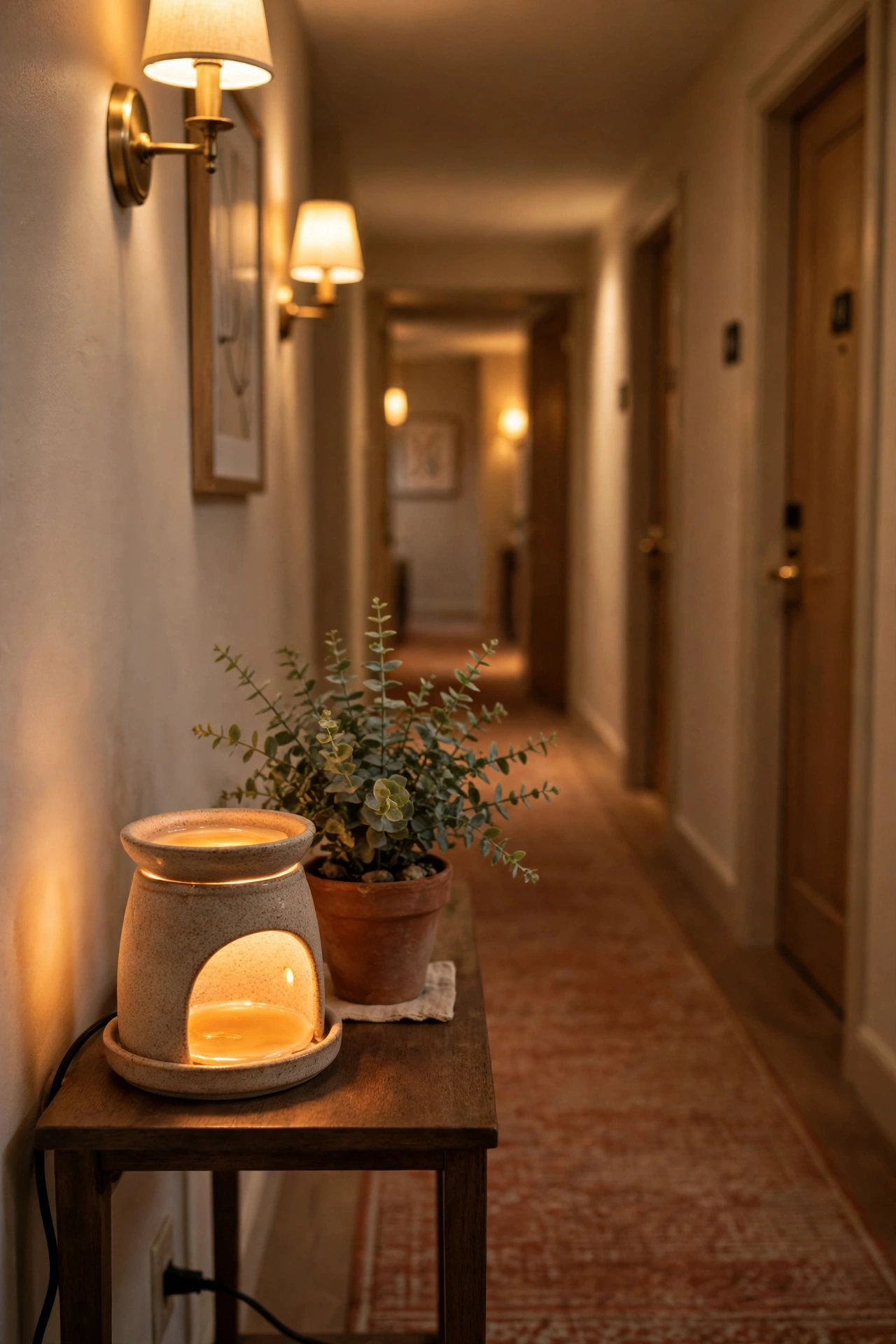
A home that smells good feels expensive — it’s the boutique hotel effect. One signature scent through wax melts or diffusers, consistent across rooms. I tried this and the one mistake to avoid is a different strong scent per room; walking from lavender to “ocean breeze” to cinnamon is jarring. One scent story, whole house. Place the diffuser where air circulates — a hallway or near a vent carries the scent through the house. Test the scent for a full day before committing to it.
Cost: ~$4 | Time: 5 minutes
21. The Front Door Moment
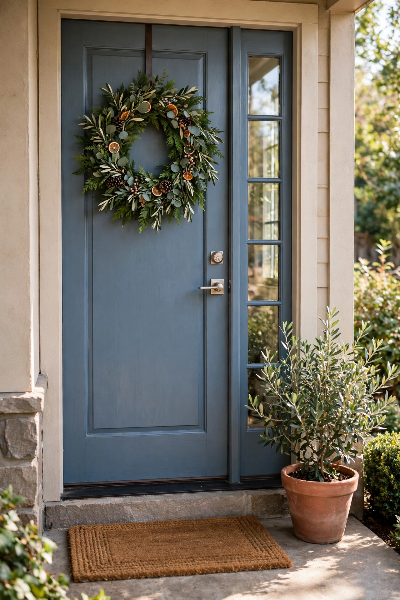
A wreath, a clean doormat and a potted plant by the front door set expectations before anyone steps inside. It’s the cheapest curb appeal there is. I tried this and the one mistake to avoid is the faded, sun-bleached wreath from three seasons ago; it says neglect louder than no wreath at all. Fresh or nothing. A freshly swept step matters as much as the decor — clean paving makes even simple styling look sharp. First impressions start at the kerb, not the sofa.
Cost: ~$10 | Time: 20 minutes
Not-Cheap-Looking Decor FAQs
What’s the number one rule for making dollar store decor look expensive?
Matching. Uniform sets — same frames, same jars, same finish — read as curated no matter what they cost. A single mismatched item undoes ten matching ones, so consistency beats quantity every time.
Which dollar store items should I avoid?
Anything trying too hard to look like something it isn’t — plastic pretending to be crystal, or shiny “gold” that chips. Honest materials like glass, wood-look and matte finishes always age better than imitation luxury.
How do I stop it looking like a dollar store exploded?
The edit. Fewer, better-placed items with breathing room between them look expensive; surfaces crammed with bargains look like a shop. Buy less than you want to, then step back and admire the restraint.
Does lighting really make that much difference?
More than anything else on this list. Warm white bulbs flatter every finish and hide every shortcut. It’s the cheapest transformation here and the one guests notice without knowing why.
Twenty-one ideas, and the through-line is simple: match, edit, warm the light, and let texture do the talking. Nobody needs to know what you spent — and honestly, that’s half the fun of it.
